The Project
ParkingTix is an app that allows users to pay and dispute their parking tickets without going in to court. The project was inspired by a prompt provided by Google as part of the UX design program. I developed the UX for the project as part of the Google UX design professional certificate program on Coursera. The project took 63 days from its inception to its completion.

Empathize
The first phase of the UX design process is called empathize. In the emphasize phase a UX designer conducts research on his user base to determine what their needs are. The empathize phase typically includes user interviews, user personas, user stories, and user journey maps. These exercises and tools can help the designer get to know their user which is the first phase in developing a product.
User Interviews
In this particular project I did not conduct user interviews. Instead, my instructors provided sample interviews to simulate this step. I read through the user interviews and moved on to the next step, which was user personas.
User Personas
After reading through examples of user interviews I developed examples of potential users called user personas. In real design scenarios user personas are supposed to be based on research like user interviews and demographic analytics. In this exercise it was sufficient to merely develop a persona that had some of the attributes of a target demographic. These personas were one-page documents containing details like fictional names, a picture of the user, a brief description of the user and his demographics, and a quote that expresses something of the user’s personality.


After creating user personas I moved on to the next exercise in the empathize phase, which was user stories.
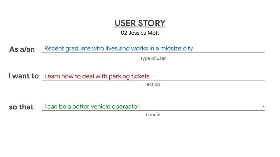
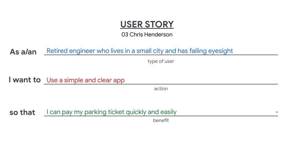
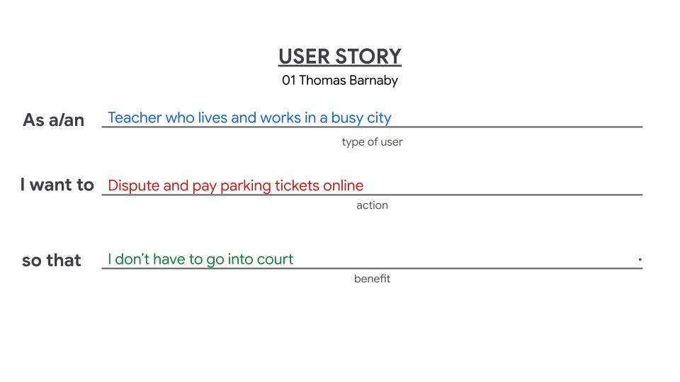
User Stories
User stories are short stories that describe potential users and the problems they have. These stories are based on the information contained in the user personas and always have one of the personas as their subject. The purpose of user stories is to summarize the relevant challenges faced by potential users. These user stories later serve as a jumping-off point to start thinking about possible solutions.
The formula for user stories provided by my instructors at Google was:
“As a/an [type of user] I want to [action] so that [benefit].”
I used this formula to develop user stories for each of my three user personas, Thomas Barnaby, Jessica Mott, and Chris Henderson.
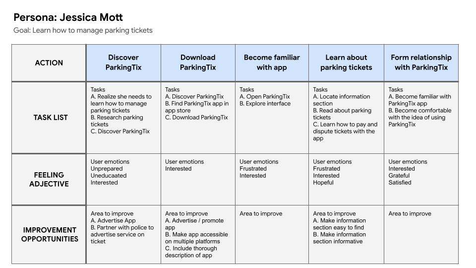
User Journey Maps
After writing user stories I made what are called user journey maps. User journey maps are a visual representation of the problem a user has and the process he goes through to solve that problem. A user journey map is broken down into a grid of squares and in each square is a brief description of the user’s situation, his feelings, and the steps he takes to solve his problem. I made a user journey map for each of the user personas I developed earlier in the empathize phase.


Define
The second phase of the UX design process is called “define.” In the define phase the UX designer develops an understanding of the users’ problems and selects a problem that he would like to solve. The solution to a user’s problem is very often an opportunity for a new product or service. In the define phase the UX designer practices exercises like writing problem statements and goal statements.
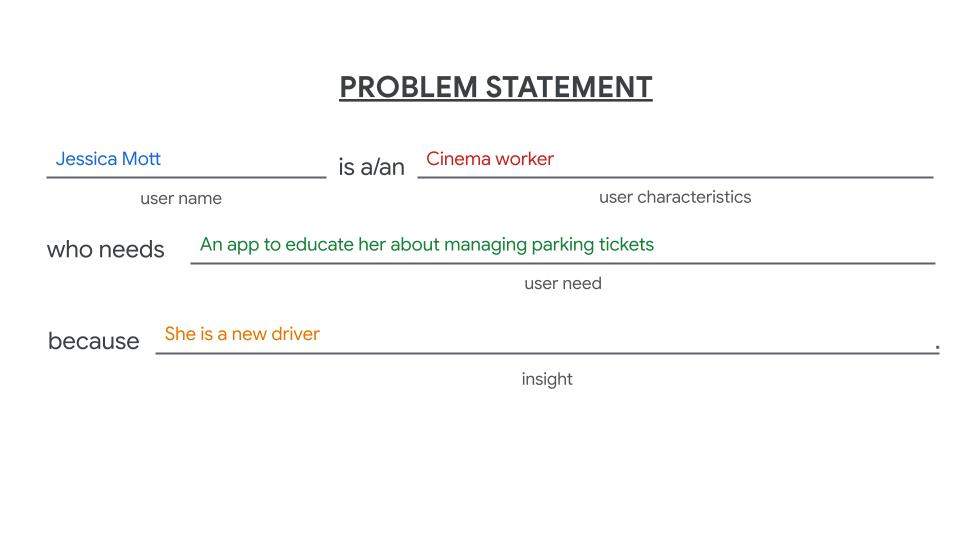
Problem Statements
Part of the define phase of the UX design process is the exercise of writing problem statements. A problem statement is a brief description of a user’s problem that the designer hopes to solve with his product or service. Problem statements are typically based on research and written for each of the user personas developed during the empathize phase of the design process.
Problem statements are typically written according to the following formula:
“[User name] is a/an [user characteristics] who needs [user need] because [insight].”
I wrote 3 problem statements, one for each of my user personas, as part of my ParkingTix app design project.


Goal Statement
A goal statement is a brief statement that details the proposed solution to a user’s problem. The goal statement is typically supposed to offer a direct solution to the problems described in the previously mentioned problem statements. The proposed solution is typically the product or service being developed by the UX designer and his team.
A goal statement in the formula offered by Google would read something like the following:
“Our [product] will let users [perform specific actions] which will affect [describe who the action will affect]. We will measure effectiveness by [describe how you will measure the impact.]”
I wrote 1 goal statement that proposed ParkingTix as a single solution to the problems described in the previously developed problem statements.
[Goal statement]
Ideate
The third phase of the UX design process is ideate. The ideate phase is all about brainstorming. In the ideate phase the UX designer works on developing as many design solutions as possible to solve the user’s problems. During the ideate phase the UX designer practices such exercises as rapid sketching and storyboarding.
Rapid Sketching
Rapid sketching is an exercise in which the UX designer draws as many possible design solutions as possible in a short amount of time. One specific form of rapid sketching is an exercise called “Crazy Eights,” which is so named because the designer divides a sheet of paper into 8 sections and draws 8 design ideas in 8 minutes.
I practiced the “Crazy Eights” exercise while working on ParkingTix to develop a variety of possible designs for the various pages of the app.
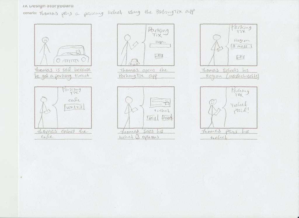
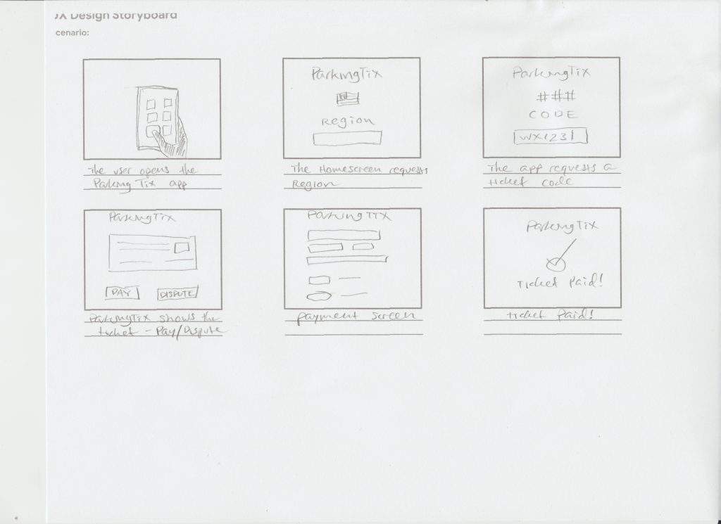
Storyboards
Storyboarding is an exercise in which the designer imagines their user interacting with their product or service. Storyboards are a little bit like comic strips. UX designers draw storyboards that tell the story of a user as he interacts with the product or service. Storyboards can be drawn from a distance or they can show the product up close. In wide-shot storyboards the designer typically focuses on the broader context in which the product is used while in close-up storyboards the emphasis is typically on the details of how the product would work.
I drew 2 storyboards for my work on the ParkingTix app, one from a distance and one showing the product up close.
Prototype
Prototype is the 4th of the 5 phases of the UX design process. During the prototype phase the UX designer typically does most of the tasks that are most closely associated with UX design work. The prototype phase typically consists of the production of wireframes, mockups, and prototypes.
Wireframes
Wireframing is the first task in the prototype phase of a UX design project. In the wireframing process the UX designer works on producing simple images that express the basic look and feel of the product being designed. The wireframe is like a rough draft of the product being developed, usually an app or website, by the UX designer. UX designers often make two versions of their wireframes, paper and digital.
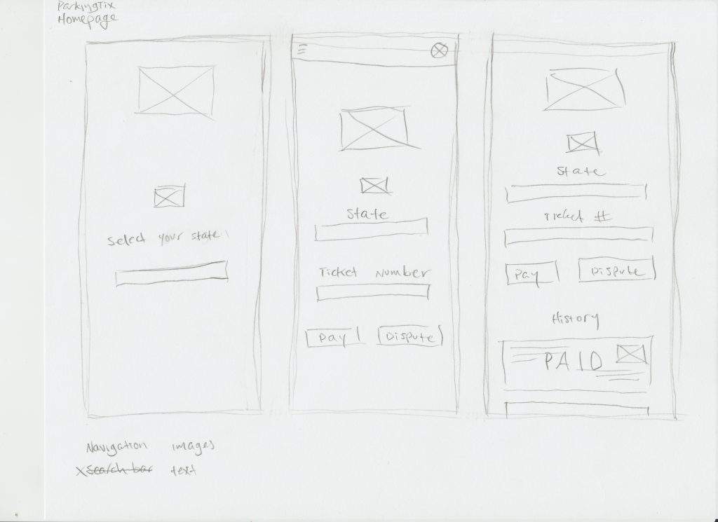
Paper Wireframes
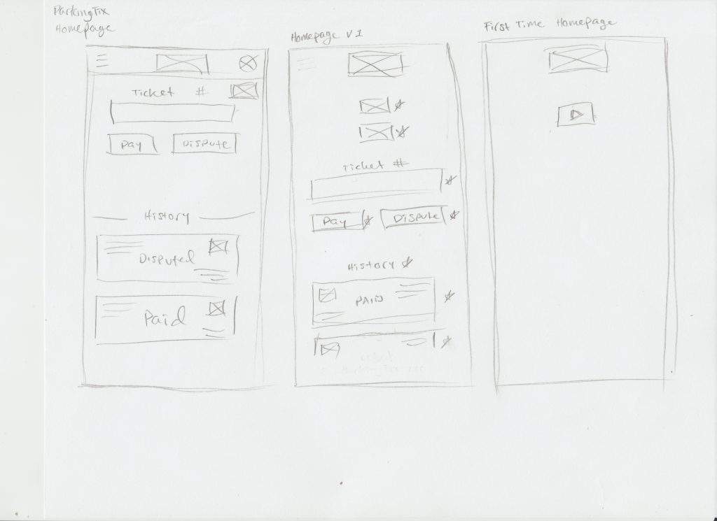
UX designers often make paper wireframes before moving on to digital. Paper wireframes are an effective tool in the UX design process because drawings are cheap, easy, and quick to produce. Paper wireframes are easy to edit as well; with just a few strokes of an eraser a UX designer can have a clean space to try a new design element.
I developed paper wireframes for my ParkingTix project.
Digital Wireframes
After creating paper wireframes the UX designer typically moves on to digital wireframes. Digital wireframes can be based on the drawings made in the previous step. They are typically composed of simple computer-generated shapes laid out in design software like Figma or Adobe XD. Digital wireframes give a better general idea of what the app or website will look like and the digital format provides a good jumping-off point for the next step in the design process. I made my digital wireframes in Figma.

Lo-Fi Prototypes
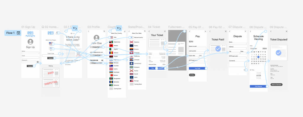
After building digital wireframes I built a prototype. A prototype is an interactive model of an app or website. Prototypes are typically composed of wireframes or mockups with interactive elements and connections between screens. Prototyping can be done on paper but is often done in UX design software like Figma.
The term “lo-fi” is short for “low-fidelity,” meaning that it looks less like the final product. I started with a lo-fi prototype, which is a simple prototype built with wireframes. Lo-fi prototypes are designed to convey an idea of the basic functionality of an app or website. Lo-fi prototypes do not typically include more refined design elements like typography, color, or images. Digital prototypes are typically made by connecting elements on a page with another screen, allowing the user to move between screens.
I built a lo-fi prototype in Figma.
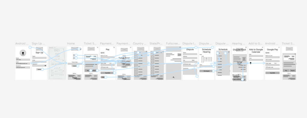
You can view the lo-fi ParkingTix prototype here.
Mockups
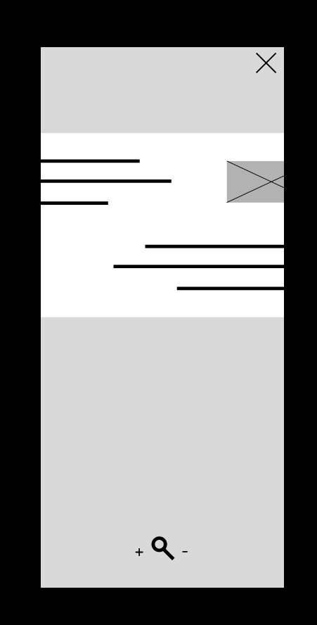
The next step in the prototype phase is building mockups. Mockups are more detailed designs of an app or website. Mockups are higher fidelity designs that closely resemble the final design. Mockups are like screenshots of an app or website that are not interactive. Mockups are based on wireframes and used to create high-fidelity prototypes.
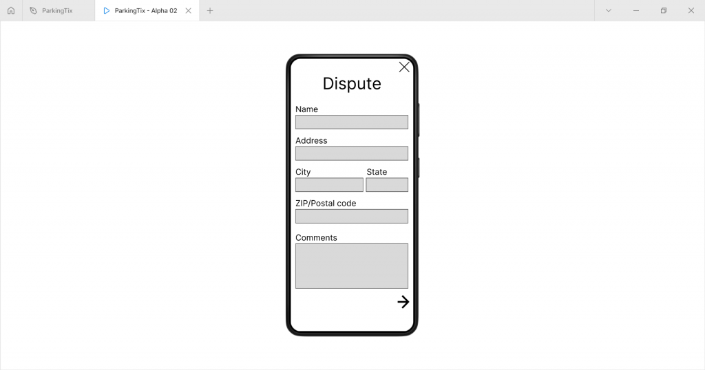
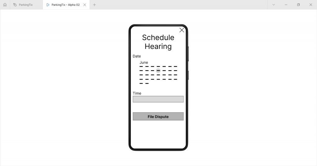
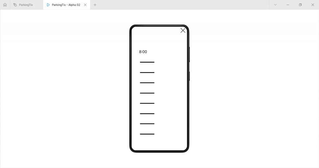
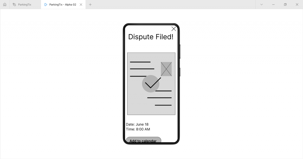
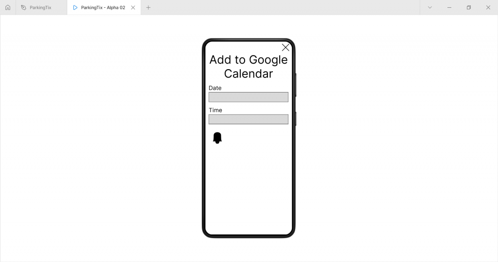
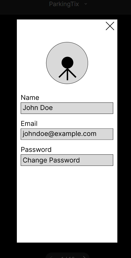
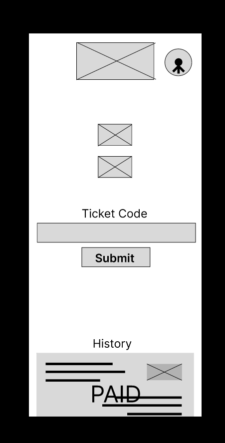
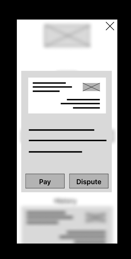
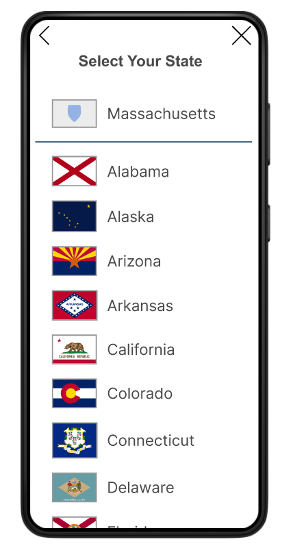
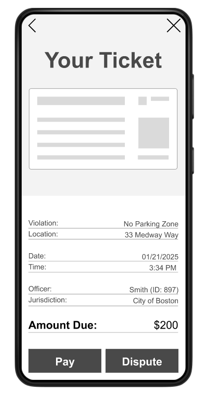
Hi-Fi Prototypes
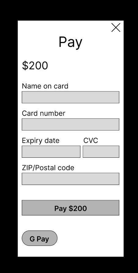
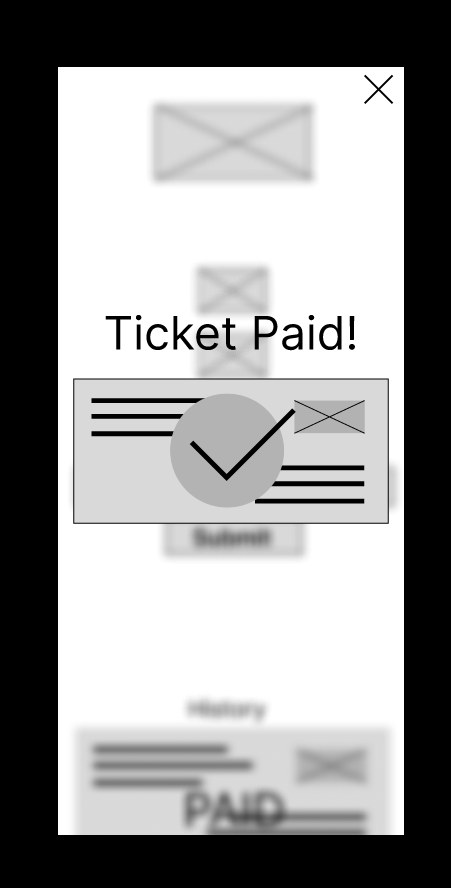
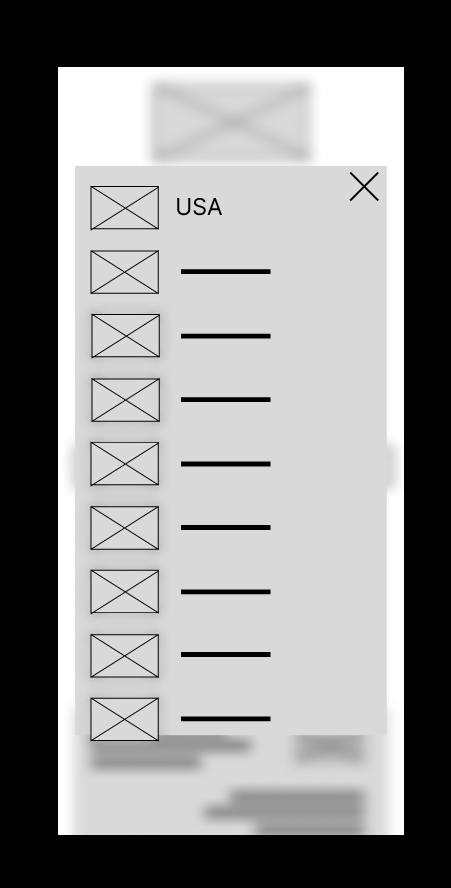
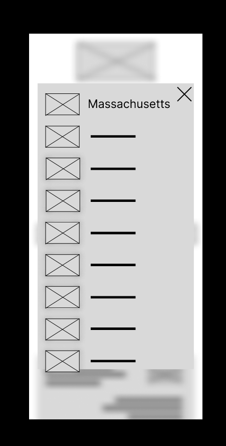
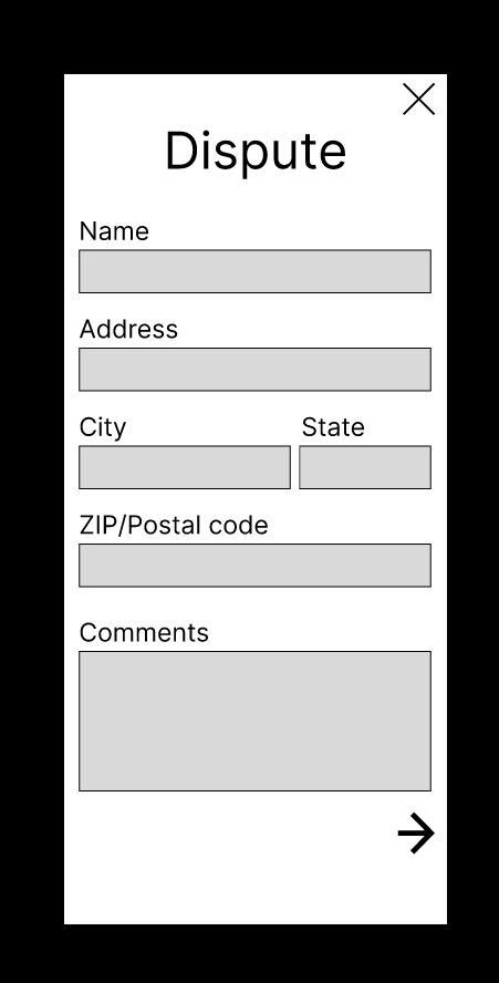
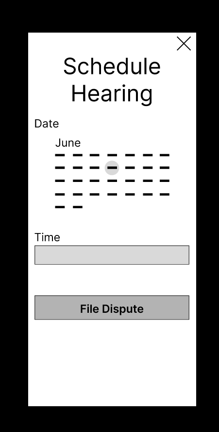
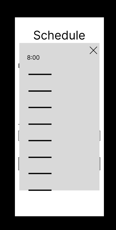
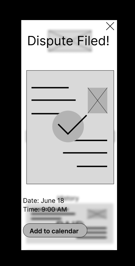
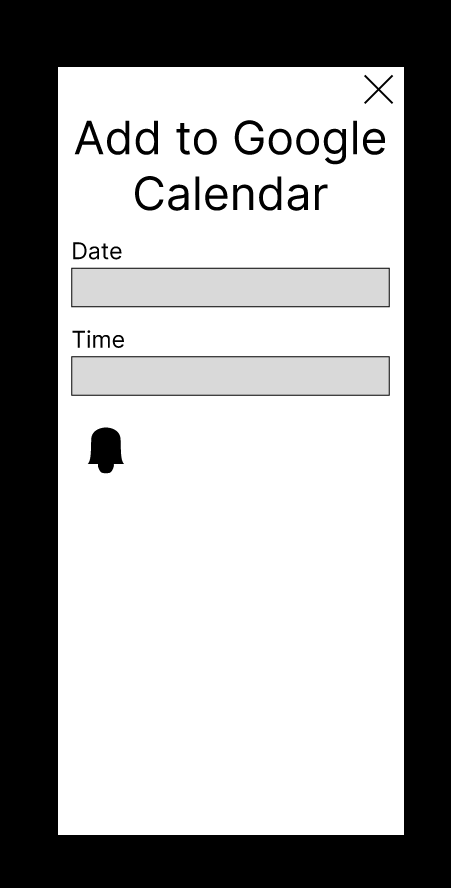
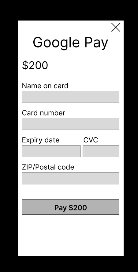
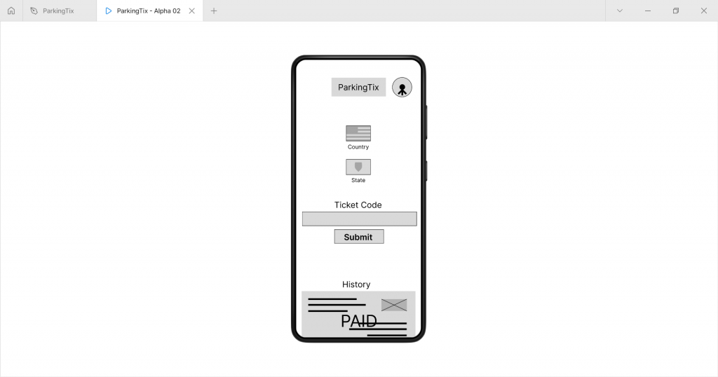
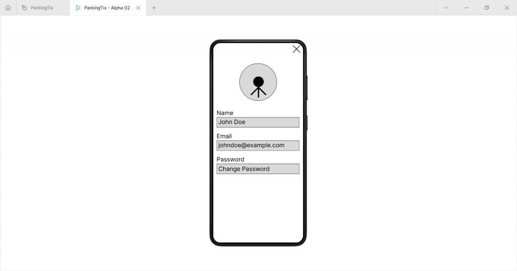
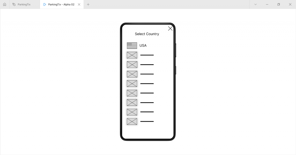
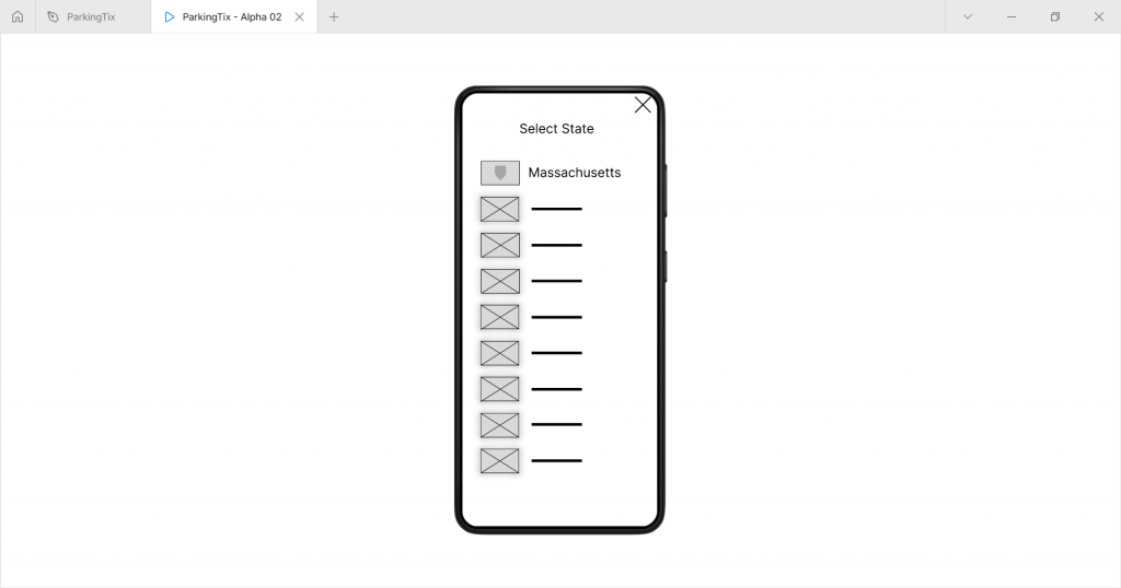
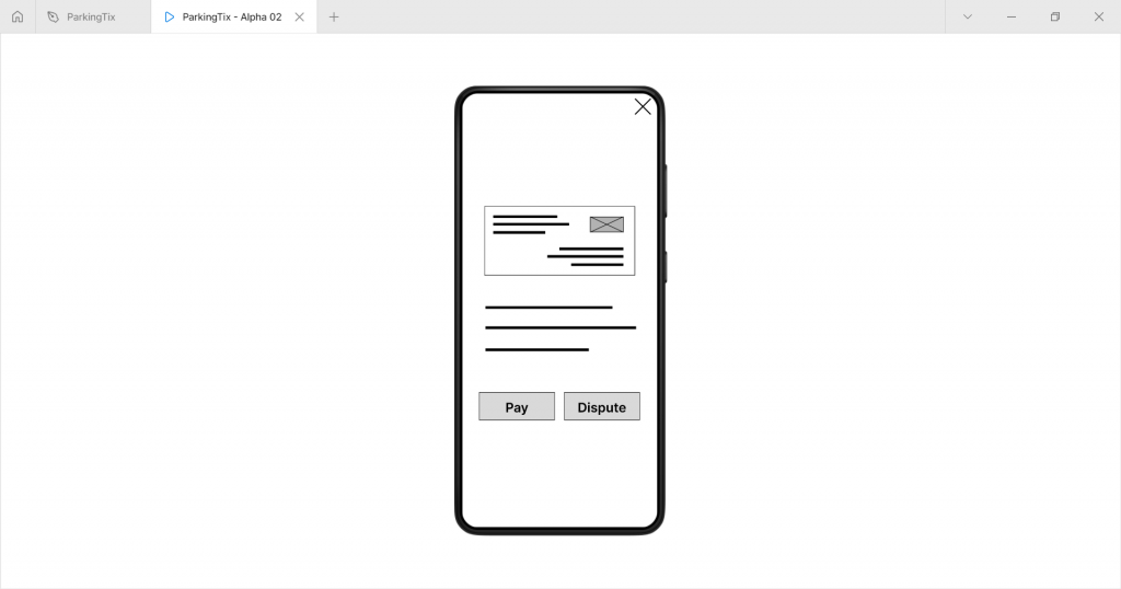
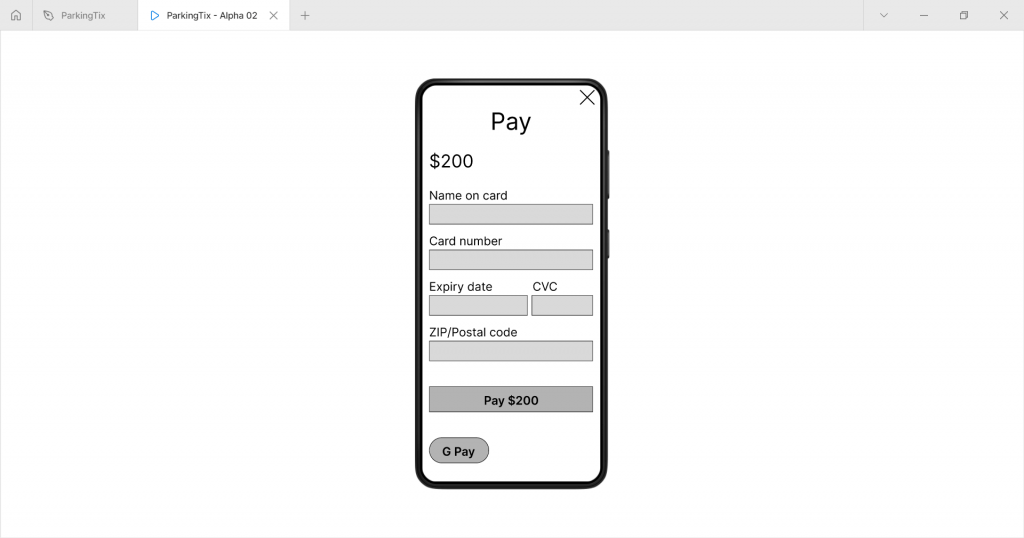
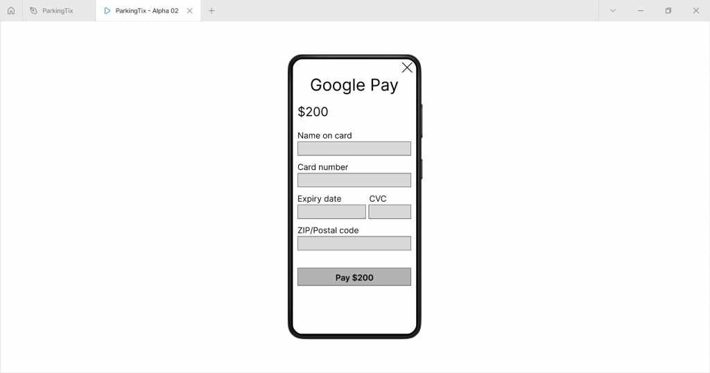
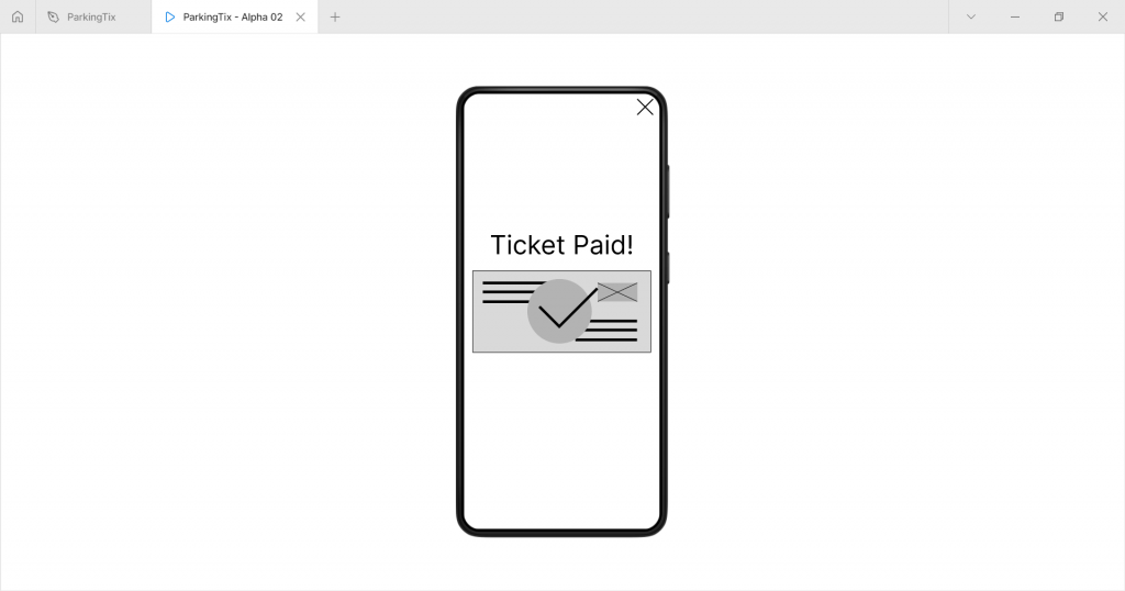
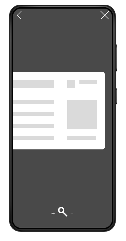
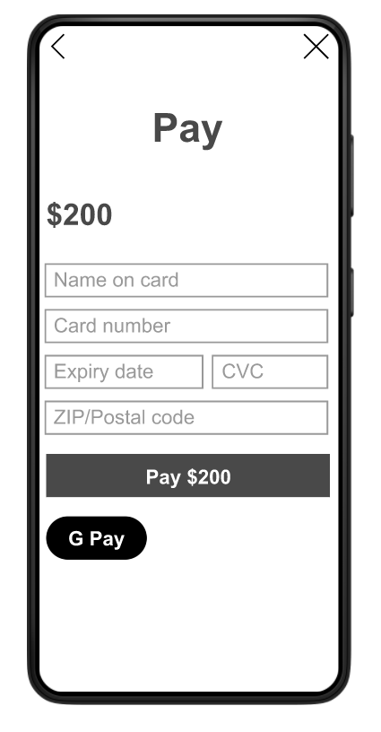
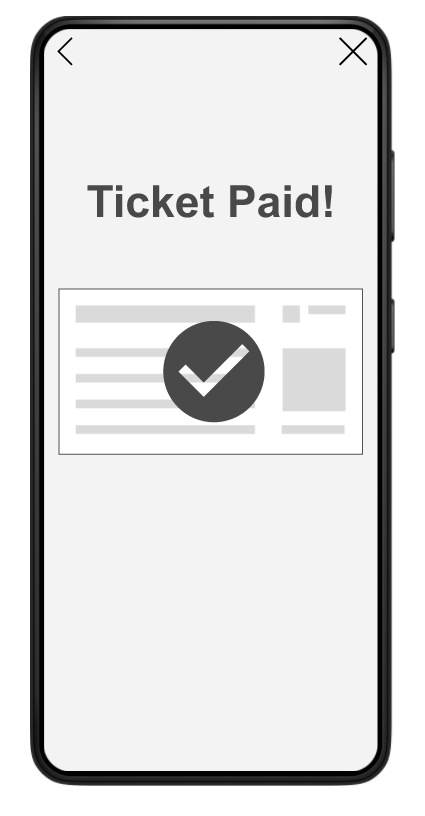
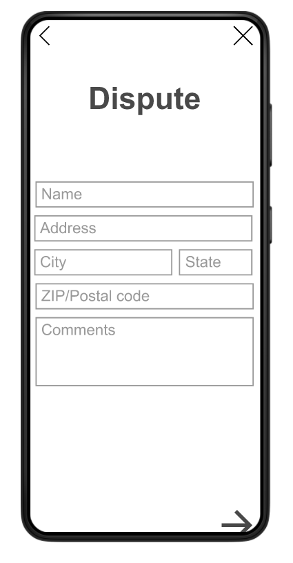
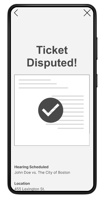
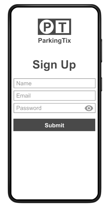
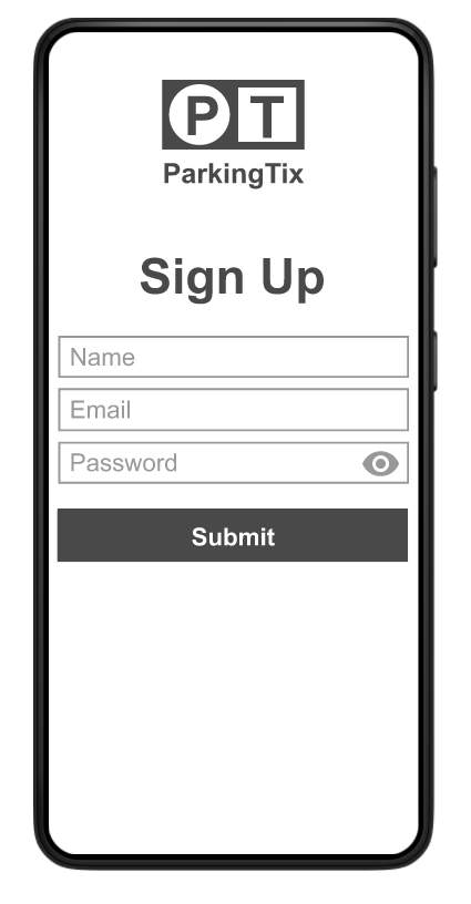
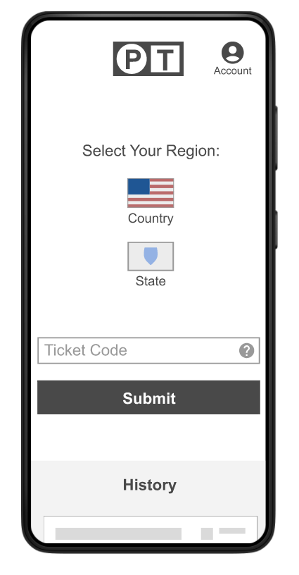
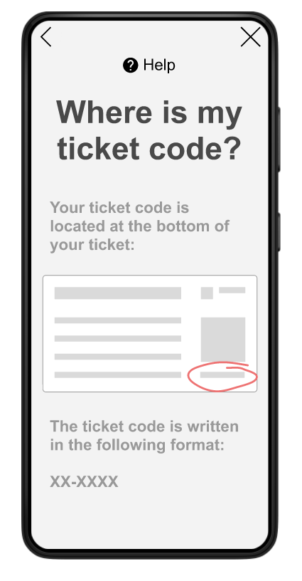
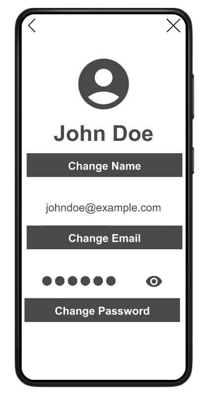
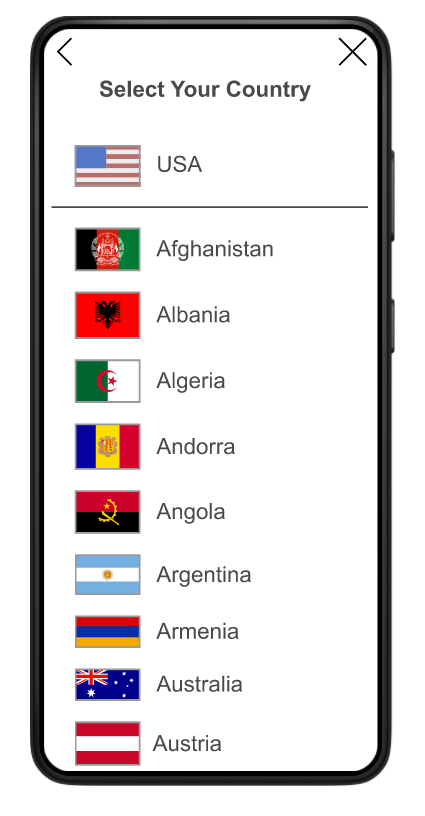
After building the mockups for ParkingTix I made hi-fi or high-fidelity prototypes. These high-fidelity prototypes had a more refined look and provided a good idea of the functionality of the app. The ParkingTix hi-fi prototype included such features as a functional simulation of a sign-up screen and a functional simulated payment system.
Test
The fifth of the 5 phases of the UX design process is test. The test phase is not truly the final phase of the UX design process; the design process is often expected to continue with tests and design iterations as long as the product is in development. There can be many prototype and test phases in a UX design project, depending on its scope and lifespan.
In the test phase the product, usually an app or website, is presented to testers so they can use it and provide feedback. This can be done in a crit session or a usability study or both.
Crit session
The term “crit session” is short for “criticism session.” In a criticism session the prototype is presented to a tester, often a designer, engineer, or other expert, and the tester provides criticism. Crit sessions are a good way to generate feedback quickly. I did not use a crit session in my design process for ParkingTix.
Usability Study
A usability study is like a criticism session but it differs in a few ways; usability studies typically have multiple testers; these testers are often from targeted demographics in the product’s intended user base and they are often not experts design or engineering. There are different kinds of usability studies but most studies include a list of tasks and questions to be completed by the testers. Usability studies are often recorded. After conducting a usability study the designer typically takes notes on the feedback given by the testers. Google recommends taking notes in a spreadsheet format and provides a template for designers to use.
I conducted 2 usability studies as part of the ParkingTix UX design project. My usability studies had 5 participants each. My testers provided excellent feedback on my designs and helped me refine them.
I implemented user feedback in my designs and created a final prototype.

You can view the final ParkingTix prototype here.
Thank you to everyone who helped me with this project! I couldn’t have done it without you.